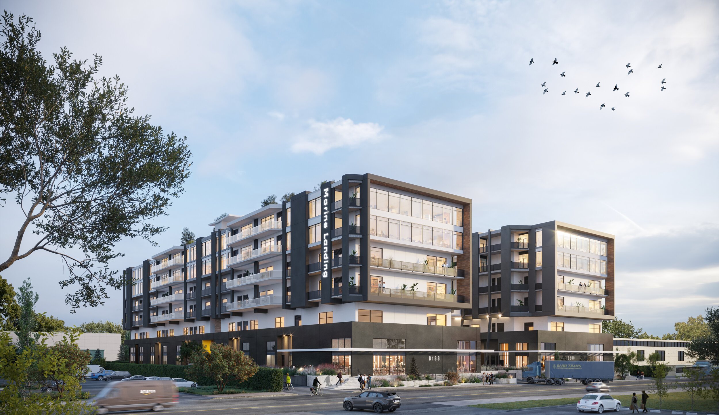
Marine Landing Building
space in progress
We’re happy to introduce this new commercial development by Wesbild. In collaboration with MGBA, the project is comprised of two buildings, with six stories each and top notch amenities. Our goal is to provide visionary makers, fabricators, and business owners an opportunity to stamp their personality within their own spaces.
This new development carves out spaces for business owners wanting to grow, distribute and reconnect; where industry meets creativity and ingenuity. Hugging the tumultuous Fraser River and located within South Vancouver, we are providing a home base for visionary makers, fabricators and those wanting to establish themselves and reshape their futures. Businesses can make their mark and stamp their name on the raw canvas we have forged.
we fabricate the place, you provide the character
Our inspiration was founded on the project’s history and location. Located on an old wood mill, our material selection and concept development took cues from the raw, weathered goods found on site and adapted their application to suit Vancouver’s elevated style.
Moody and impactful, the materials we selected were inspired by the wood working process, and thus are durable and suitable for the messy innovator. Further, we wanted to incorporate materials that aged and patinaed over time. The palette is made up of natural, local harvested oak; warm leather details found within the signage and seating; polished concrete floors, exposed ceilings, and blackened metal. Overall, the materiality will focus on celebrating the industrial nature of the neighbourhood and streamlined aesthetic.
rugged arrival
Signage and wayfinding were cleverly integrated into the architecture of the building. Examples of this are found through the leather signage, custom wood directory, and the bespoke leather graphics identifying important functions.
We found that parkade entries were often overlooked as part of the arrival experience, when in actuality they are the primary approach for most people. With that in mind, we provided a distinguished painted portal in the parkade that relates to the lobby design.
contrasting nuances of collaborative spaces
The building is designed to move people, industry, and materials through it like a well-oiled machine. As such, it was important to keep some of the building raw and exposed.
The shared spaces, such as the amenity and meeting rooms, contrast against the darker, and moody palette of other key areas. Tenants have access to host impromptu meetings or events, take in some down time in front of the T.V, or enjoy direct access to the outdoor patio spaces for a coffee or cocktail. The lounge features exposed ceilings, warm leather, and wood detailing, as well as cheerful, modern fixtures and furniture.
tailored industrial meets timeless durability
The end of trip facility and gym was an opportunity to tailor the composition of the spaces and providing a necessary function to those occupying the building. Located in the subterranean level, we were considerate of a design that endured daily use and remain timeless. Inviting and edgy, we carried the gritty, industrial look through the exposed ceiling, large format concrete tiles and an overall darker palette. Mosaic tiles inspired by worn leather and wood oak contribute to additional warmth, while still maintaining the durability needed within these spaces.
Our purpose was to encourage change and growth; to inspire innovation, and to celebrate artistry. We wanted to convey permanence and sophistication by exposing the interior architecture and through our execution.
Scope
Client
Wesbild
Agency
Edit Studios Inc.
Architect
MGBA
Branding
Free Agency Creative


